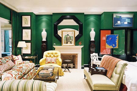
Decorating with the colour for 2013 is going to be great fun, particularly as no one seems to have really nailed just what colour emerald green is.
Column by Helen Devmac
If you look at the trendy magazines, you will see that various shades of green including an almost turquoise green are being passed off as emerald green.
Magazines rushed in to print without first determining just what emerald green looked like, perhaps emerald green like beauty is in the eye of the beholder! And that is where the decorating fun begins, when we can all just about individualise our interpretation of emerald green.
And to be quite honest, with so much green around us at this time of year, I too am getting confused about Pantone’s colour of the year.
All the same, I am rather encouraged by the green part of this colour; green for me is the colour of nature, it means peace, tranquillity and is almost a perfect colour for any scheme.
Someone once said that green was a colour that went well with anything because it is literally everywhere, take a look outside your window at the grass, trees shrubs and flowers, and I think that is where we will be getting our inspiration in dealing with this colour. ‘God’s own favourite pallete’
Green with its many shades is God’s own favourite palette for everything that surrounds us in nature. And I can see why it has been easy for decorators to go “gaga” over green, forgetting the emerald.
That is what the confusion is all about, the “emerald” part of the green. And for most of us in Zimbabwe, emerald green is a colour very near home. I don’t know why I should have been confused about emerald green, we have emeralds in Zimbabwe and there are also many memories that can be conjured up by emerald green.
If you are of Irish descent, you will know all about the Emerald Isle and may have seen pictures of the shores of Northern Ireland, with its green scenery.
Shade, part of Zimbabwean mineral wealth and heritage
If you attended a government school in the pre-independence era in the 60s and 70s, you will no doubt have come across a peculiar shade of green that was known as public works department green (PWD green).
Government schools could be spotted from a distance, even from the air I am sure. PWD green was used to paint school gates, roofs and fences, window sills, floors and some school dormitories had window slats in PWD green.
Even hospital ablution blocks and ward floors spotted PWD green.
It was just a colour of things as they were, neither fashionable nor attractive and not anybody’s favourite colour. Perhaps because of its association with school and public buildings.
One or two schools use this colour to this day, and if you go around the suburbs of Harare, you will still find gates, roofs, etc in PWD green. And while I was looking at magazine articles raving about emerald green and how it could be used in glassware, cushions, etc, I suddenly came to the realisation that emerald green was PWD green and that in the Close in which I live, all gates including mine, are painted PWD green!
And of course there are “Sandawana” emeralds, a part of our heritage, rich and majestic and the colour of royalty. So after all the hype and confusion about emerald green, I am feeling very comfortable in the realisation that it is a colour very close to home, something in my past easily recognisable and a part of our vast mineral wealth.
It is truly a beautiful choice for 2013 and guess what? At last PWD green has come of age! It is in fashion! Thank you Pantone!